What’s Your Numbah, Sugah?

03.01.05 the date that I like to think changed my life forever. It was that date 8 years ago that I met my soul mate and never looked back. We still to this day wish each other “happy anniversary” the first of every month. It has turned into more of a game so many months later who can wish it first and on what media device. (I usually win on all accounts)

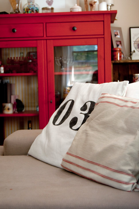
03.01.05 are our numbers. Period. Even when we (finally) get married I’m sure we’ll still do something special on the first of March. These numbers were my semi inspiration for a project I’d been dying to do. As seen in a previous post I recovered my blue college apartment pillows to match our red cabinet. Love them. The fabric however was rather summery and just doesn’t work year round.

graphic-diy-pillow

Graphic and typography items are popping up everywhere; numbers, letters, quotes. I decided to take our most treasured numbers and create graphic pillows for the living room. The process was easy. Find a font you love, I used the font “Elephant” (should be standard on most PC’s) I really liked the vintage feel of this font; the serifs, the almost hand typed feel if you could call it that.

graphic-number-pillow

Once a font is selected increase the font size, a lot. I think my letters were done at a 60 or 70 point. Print them out, tape or rubber cement the print down to a thicker piece of paper, and cut them out to form a stencil. If you have a steady enough hand I recommend tracing the number/letters with pencil and painting within the pencil lines. You could also use the stencil as a true stencil but I found the paint tends to sneak underneath creating less than graphic crisp lines.

diy-graphic-pillows

I used cheap yet thick and sturdy fabric from Ikea, $3.99 for half a yard and typical craft paint $2 in a charcoal gray. You could use a fabric medium if you chose to but I found the paint spread and held just fine, even after washing. I used a graphic red striped fabric (also Ikea) for the reverse side to play with the red accents throughout the room and the vintage graphic feel of the pillow. I used the same pocket hemmed technique illustrated in the previous pillow post, an easy way to create removable pillow covers.

pocket-hem-number-pillow

I really love how they came out and adore that they reflect something so meaningful to us in such a subtle, stylish way.

diy-number-pillow

PS Happy Anniversary Babe! 8 years (AAAHHHHH!!) Time really flies when you’re having the time of your life. Looking forward to many more adventures together. Love you!

What I Bought on my Summer Vacation

As mentioned in a previous post, we ventured to the center of New York State for a family reunion. On our way home through back country roads, we happened upon a little antique shop on a corner, a corner that held my ‘chair destiny’. Wrapped around the building was a multitude of dining chairs on display. Big ones, wood ones, ladder backs, 50’s vintage, and 2 mid century modern beauties. As my head craned and almost detached, eagle eyes locked on my dreams quickly moving out of view I shrieked at my future hubs, “aahhh! Stop! Reverse! U-turn! Chairs. Dream chairs. Please U turn. About face! HUURRRYYY!” I think I straight up stopped forming sentences mid way through my spazz out. A U-turn he did make and chair destiny we did fufill.

Oh yes. And it gets better. We checked them out, 1 leg looked a little wobbly (and by wobbly I mean basically detached), the wood finish was flaking, and the seat fabric wasn’t my dream BUT the lines were perfect and exactly what I’ve been looking for for almost 2 years. I’m sure I looked extra lovingly into Mr. Fabulous’s eyes with that “I absolutely can’t live without these” look and he agreed, they were pretty snazzy. ***upon proof reading Future Hubs would like the record to state that “pretty snazzy” was not in his vocabulary that day*** As we carried them around the corner to chat with the owner, I prepared my haggling brain. “So how much are we willing to spend? I’m thinking like $20 a chair tops.” Mr. Fabulous didn’t totally agree as one was breaking, he was thinking $15 and $10 for the slightly damaged one. I heard where he was coming from but still after searching forever for chairs this fabulous I was set on $40 for the pair max.

We found the owner, told him we were interested in the chairs and asked for a price. He shifted his stance and said “oh I dunno, $10 for the pair?”
….

(pause for dramatic effect)….

….

“SOLD! I’ll grab my cash!”

I don’t know how I didn’t kiss this man. Dream chairs for $5 a piece. I kid you not the exact chairs in New York City would easily have been $20-25 each. Got to love being in the country.

I will confess the chair leg fell off as we were loading it into the car but I didn’t care. A little wood glue and all would be fine. Needless to say these beauties are my next little project and I can not wait. A play by play on the rehab is soon to come. Basic goal is fix the leg, sand down, re-stain, recover the seats, and enjoy.

Did any of you find a must have house item this summer? Freak out on your significant other over chairs of destiny? Let me know! I love hearing your stories.

Custom Up my Buttons Baby

You are ALL welcome for getting that award winning song in your head. (Obnoxiously catchy pop music by sexually suggestive named groups anyone?)

In an upcoming post I’ll be divulging you all with my first ever recovered furniture piece. A tufted upholstered bench that lives at the foot of our bed. A bench, I might add, that was plucked from the garbage. Got to love free.

The first (and easiest) step of recovering the garbage picked bench was creating covered buttons to match the new fabric. A quick trip to Joann’s landed me a pack of buttons for covering complete with the covering tools. I believe the kit cost $4 for 10 buttons.

Directions found on the back of the box were very straight forward. First use the fabric template to trace the pattern onto the desired fabric. Step 2, cut around the traced circle.

Step 3 assemble the fabric, button, button back, and circle tool for hammering, then hammer the set up into place. I found it was easiest to kind of push everything together by hand just enough so it stayed in place and then hammer it in for good.

After a few good taps remove the freshly made button from the assembly, give it a push or two for good measure and get pumped that you have made custom fabric covered buttons in no time flat.

Chalk Board and Chicken Wire

Even though we’re currently a small family of 2 (with no plans on expanding any time soon) we still have a lot on our plates. From fire house activities to family gatherings we can be a pair of busy bees. I’m a rather organized gal and when I feel lost in a sea of information you know there’s a project right around the corner to fix things.

Our “message center” was pretty pitiful; a calendar strategically hung to block the fuse panel in the kitchen. I wanted more. Places to jot notes, see the month at a glance, hang important info, pictures, gift cards so we don’t forget to use them. I wanted an impressive fully functioning (and pleasing to the eye) message center that all the cool Mom’s get.

After stalking a few ideas on Pinterest (beyond obsessed with that site) I made my decision. Chicken wire bulletin board with chalk board doodling counter part.  Love the idea of listing menus for the week or happy notes to my significant other who at times can be 100% opposite schedule.

Chicken Wire Inspiration Board

from forageddesign.com

We changed a few parts of our design to include a frame and a fabric back (to hide the ugly electric panel). Construction for the chicken wire board was pretty straight forward. Well, after working out the kinks and a few failed attempts it ended up being straight forward. For the chicken wire board cut:

  • cut chicken wire to desired size (including width of trim)
  • For us, we wanted to cover a semi unsightly electrical panel so we also cut a piece of fabric (muslin) to the same desired size as the chicken wire.
  • Cut trim pieces to fit; miter for nice 45 degree joints.
  • Square up trim and fasten with glue and scary looking metal wood joiners. Let dry.
  • Create a sandwich of trim-chicken wire – fabric face down on a flat surface.
  • Add one staple in the center of one side of the back.
  • Add staple on the opposite side.
  • Continue around with 1 staple, centered on other 2 sides.
  • continue to pull/stretch fabric around on all sides. (Working out from center staple out mirroring on opposite sides)
  • Flip over and hang with everyone’s favorite no hole hangers (command hooks)

For the chalk board, we used leftover extra thin plywood from our floating dining room shelves and more trim. This time we used a little fancier trim with a little more of a revile. Cut the plywood to desired size, trim to match. Miter fasten with glue and staples and bam. Ready to go. I do recommend doing all painting before assembly. It at least made my life easier.

Let’s just say I am darn happy with our new super organized and rather stylish message center. Also for the super thrifty lad or lady, free calendars can be stunning when folded in half (blocking the ugly UPS picture) and adding your own picture above.

Outdoor Bistro Excitement

Hello folks!

I’ve been running around like a crazy lady with back to back wedding weekends, mini vacations, and 5k training just to name a few. Needless to say, I’ve got lots of exciting things to be posting about very soon. One quick post for now. We finally found a moment to reschedule our Ikea Date which has been in the works since before Christmas. The date was fabulous. Silliness did arise. Obviously. We are talking roughly 120,000 square feet of “lets play house” after all. Ahh Ikea. How I love thee. In addition to the silliness we were also quite successful in our travels bringing home some loot including fabric for some pillows I will be whipping up, a basket for hiding some Xbox paraphernalia, and these little babies:

Chairs to complete our little bistro dining in the sky. Ahh. I can’t wait for a sunny Sunday brunch. This is of course not the finished product. I have plans to spray the table a rubbed bronze to complement the chairs a little better.

Now for the price break down (and the reasons I love Ikea) I wanted those super cute and fabulously timeless little French bistro chairs. You know the one’s that are all over Bryant Park in the city (New York City for those of you not in the greater NYC area).

You know the ones that can be found online for a reasonable $198 a chair or $318 a pair. Ooof. Seriously? $200 for a little bistro chair? Not for this cheap girl. No thank you. Enter Ikea: the fabulous design at fabulous prices dream land. They have arguably the same chair at a 93% savings. Now THAT’S the kind of red tag discount this girl likes.

So for $30 we got 2 brand new cheapo but equally well designed french bistro knock offs and a table for sunny summer dining. Side note: table was saved from the landfill aka found on the curb a few doors down from my parents’ house. Excellent score indeed.

Again there’s more work to be done but with such a fabulous spring evening I couldn’t resist setting them up, de-pollening the table, and snapping a few shots. Looking forward to spending many summer evenings sipping a margarita or two and early sunny mornings with some Irish breakfast tea and French breakfast muffins. Yums.

More Knock Off Designer Curtains

If it hasn’t been assumed yet through following this blog, I’m a cheap, cheap girl. I would rather spend hours and hours of personal time creating an identical piece of anything that is exorbitant in price. Curtains are obviously no exception. I’ve already shared my knock off Waverly pattern that saved me HUNDREDS for our bedroom curtains. The bedroom isn’t the only place knock off designer curtains exist in our house. I also crafted up our dining room curtains. I really wanted these fabulous curtains from West Elm featured on my inspiration board for the dining room. Grayish with Marigold horizontal lines running across them. Lovely. Unfortunately if I remember correctly they were going to be $40 or more a panel. Not a Lizzie price tag at all.

I decided the basic style of the curtains were easy enough to knock off. I started by purchasing basic brownish gray curtains from Ikea for if I remember correctly $18 for the pair. They weren’t satin/silk but for 4 times cheaper cotton would be fine with me. I then enlisted the help of my fabulous Mom to sew the horizontal stripes. We figured out how high we wanted the strips to sit (26″ from top of curtain). I also chose (since I had creative freedom and all) to make 2 stripes instead of 1, spacing them 1 inch apart.

Using Marigold satin ribbon we spaced it, pinned it, and sewed it. If anyone has a cat in their house they know how these darling creatures always want to be front and center helping with any project or activity.

The entire project didn’t take more than an hour or two including the hashing out of how high and how to space. The worst part of the entire endeavor was how wiggly the fabric insisted on being. Well, the wiggling of the ribbon and the lack of pressure on the foot of the sewing machine we were using. None the less I really love how they came out. I would argue that they are better than the originals.

Picture Perfect

I will confess, I’m usually open minded to most things, however as an Interior Designer, I can not stand when artwork is hung too high.  Frankly it drives me insane. I’m surprised I hold myself back from walking around with a hammer and nails readily armed at a moments notice to pull pictures off walls and correct this horrible fate.

Remember the one simple rule and you too can hang like a pro (and avoid crazy designers punching new holes in your walls).

The 1 Critical Rule to Hanging Artwork:

All art work should be hung at 57″-60″ on center. On center means that the center of the piece should sit at 57 inches. 57-60 inches because that’s the average eye height of a human being. (Like I said it’s so simple!)

The only catch? Rules are made to be broken. Sometimes depending on what you’re looking to do it makes sense to hang lower or higher. Example. If artwork is meant to be viewed from a seated position (ie couch) the eye height naturally will be lower. If you’re looking to make a gallery wall or other massive artwork collection spreading out to both extremes of the wall is fun and unique to do.

Here’s some inspiration for fun ways to hang artwork that we’ve been enjoying for months now.

Grouping smaller frames into a bigger overall layout. Artwork doesn’t have to be expensive to be beautiful. The upper left and lower right were pictures taken during a fall trip to the Berkshire Mountains. The upper right and lower left are simply scrapbook paper (less than $1 each) which can be found at any local craft store.

Staggering picture frames on a wall. These were pictures from one of our fall getaways to the Berkshire Mountains.

Picking a linear center point and hanging frames horizontally. In this example each frame was centered at that magic  60″ height. These photographs were mainly taken on a family trip to Maryland. 2 were from our trip to Grand Manan and the one city scape was taken by my sister.

Additional linear horizontal example. Another trick to hanging artwork is to have the images in the grouping relate in some way. Be it subject of the pieces (pumpkins) type of artwork (painting) or color palette (deep-toned Autumn colors). This pumpkin tryptic is quick little paintings I’ve done of pumpkins we’ve acquired over the past fall seasons.

Symmetrical grouping. In this example the larger Palisades Amusement Park print is the center and the other smaller prints are evenly balanced on each side. Also this is the only grouping so far that I actually “purchased” artwork. The top left and bottom right were bought off of Etsy for less than $20 each. The Palisades print was from a poster website for around $25. The other 2 pictures were from our engagement. Bottom left is a detailed shot of the Helicopter and the upper right was snapped by my man as I was getting out of the Chopper touching ground for the first time as an engaged lady. It was one of my favorite shots from the day.

I should also point out for all you apartment dwellers out there 90-95% of these pieces were hung using 3-M command hooks. These hooks are worth every penny. No holes, no mess, and super easy to use. Also, sold as most craft stores that send around 40% off coupons. Double thrifty score. After all those inspiring examples in my opinion there’s no reason for anyone to not have artwork on their walls. It makes your place feel lived in, homey, and if you chose artwork that is meaningful you’ll never get tired of looking at it.

Quick and Easy DIY Crate Coffee Table

On a family vacation to the Finger Lakes  2 years ago I found a fabulous old crate from an antique store near our lake house. There were 2  things beyond wonderful about it. It said “Buffalo, NY” on the side – Rochester (where I went to school) would have been better but really Buffalo is close enough – AND it was a mere $10. SOLD. Upon move in day this crate quickly converted into our “coffee table”. The poor little guy looked a little pathetic juxtaposed against our big and comfy couch. It wasn’t the best, but it worked perfectly until we could upgrade.

On our most recent trip to Maine we came across a few more crates, one that even got Brendan excited. An “Atlas Powder Co. High Explosives” crate from Wilmington DE (Where his Dad lives). We like to bring art and things into the house that remind us of places we’ve been, people we love, or simply stuff that tugs on our sentimental heartstrings.

The second crate we found was like a triple word score of awesomeness. Word score #1: Black & White blended scotch whiskey from Glasgow, Scotland; we love whiskey and I’m dying to go to Scotland. Word score #2: Imported through New York, NY; right out side of where we live so some “home town pride” if you will. AND for the triple word score: A shipping label to Maine! I was really hoping to find something with Maine on it since I’ve vacationed there almost every year of my life. Clearly we weren’t leaving this guy behind.

Unfortunately each crate was priced at $25. After buying 1 for $10 I felt like I wasn’t getting the best deal out there. Thankfully Bren used his bargaining skills and we got both crates AND a really great glass honey bottle for $40. I like to think we got a deal.

Upon returning home I set up the 2 new crates with our 1 existing crate. Although they aren’t exactly the same width or height they are close enough to work just fine.

The best part of the crate coffee table is it comes with built in storage and can be easily moved out of the way when we need the floor space, like for Pilates.

“Aerial” shot shows some of the “bonus storage” where we hide the tissues and the keyboard and mouse for our media center. I really love the unique look of our brand new reclaimed coffee storage table.

Color Your World

When we moved into our first apartment everything was perfect. The location. The charm. The commute. The parking. The paint, yeah, not so much. Nope the paint was horrible. The real kicker was when I asked our landlord if we could repaint the Easter basket that was our future apartment she got very concerned and then stated “as long as you paint it back to neutral”. Clearly she wasn’t an art major. Last time I checked Pink, Peach, and Yellow are not neutrals.

Dining Room - Move in Day

Living Room - move in day

Bedroom - First few days in

Bathroom - During Painting please excuse the mess.

However It’s amazing what a little paint can do to make a place your own and turn it from Easter Eggs to homey and fab. Fearing the thought of repainting when closing on a new house (our hopeful next move from here) I tried to keep our options neutral. Real neutral.

We went with “Absolute White” by Benjamin Moore in the Dining Room. It’s more a very very pale gray than an aboslute white in my opinion.

“Autumn Haze” by Glidden (I think) in the Living room. (this is slightly more beige and less gray in real life)

And Sherwin Williams “Steamed Milk” a perfect almost canvas off white. (as accurate as I could make it color wise) ***All colors were color matched to Sherwin Williams as they have the best discounts but I am a Benny Moore girl when it comes to more permanent locations.****

The easiest way to pick paint is to throw a bunch of swatches on the wall and leave them there for a few days (or weeks or months). See them in different lights, different shadows, etc. Once colors start changing and make you go “ugh”. Take them down. Eventually you’ll end up with the one that works best in your space that you truly love. Brendan more than once thought I was insane when he would find me staring at the walls for long periods of time at slightly different toned colors. (Which to him of course looked all the same.)

The Bedroom was the hardest color to chose. With my strict “neutral or repaint it” rule combined with my perfect bedroom dream and Brendan’s crazy schedule the decision was hard. The yellow existing in the room really wasn’t bad. I did like it a lot, however it didn’t mesh well with the accessories i was buying (all creamy similar to the walls color), it was very sunny and bright,not good for a boy who occasionally needs to sleep during the day, and never felt like “our” room. So I finally caved and decided to repaint. Then it came down to making a decision. My dream color was a dark blue slate gray-ish tone. Other options included a beautiful gray (top) and a taupe-y gray (bottom).

I don’t think I should admit to how long those chips sat on our wall. (Like since the week we moved in) A big help was having large scale chips. (The perks to working in an Architect’s office). If you don’t have architectural office perks you can always buy the test pots for a few bucks to get the same “large scale” effect. Final decision? The Taupe-y Gray. It’s so stunning. So us. And so neutral, well dark neutral.

The color? Benjamin Moore’s “Meditation” from their Affinity Line for our serene “Woodsy Retreat”.

ahhh pure bliss. In the end each gallon of paint cost around $27. So for just over $100 we turned a pastel hell into a true neutral paradise. In my opinion it was worth ever penny.

Something Fit for a Queen

For the first two months of living together the fiance and I shared a full sized extra bouncy bed. By November my lack of quality night sleeps found me begging for him to switch to a permanent midnight schedule and eying the couch as a sanctuary. We moved into the studio where the futon was way less bouncy and the sleeping area was ever so slightly larger. This was November… by May we both agreed that our secret hideout wasn’t cutting it anymore and it was time to invest in a bigger bed.

We agreed on a Queen sized Simmon’s Beautyrest and were beyond excited to get that sucker home. The catch was buying a mattress meant buying a bed frame. And buying a bed frame was not going to be an easy task. Everything I was finding was either too expensive for frugal me or simply not what I was looking for.

I wanted this:

Fabulous raw weathered modern yet vintage in a sense perfection.

I didn’t want this:

$1,500 price tag.

Our solution? When you can’t buy it, build it, of course!

In 1 day off, future hubs built a bed. In case you were wondering this is one of the reasons he is “the future hubs”. My fabulous man built my dream bed with my dream price tag to boot!

After he was finished with his end of the deal it was my turn to take the reigns. Finishing the wood to get that reclaimed feel. Before Brendan even started assembly I brewed a beyond strong batch of coffee and dumped it onto the 4 boards that were going to be the sides of the bed. I even applied the coffee grounds for extra effect. We left it to soak in for a few hours. It actually didn’t do as much as I had hoped but did take away that brand new yellow wood look. The coffee grounds left more concentrated saturated dark areas. This made the wood like like it was covered in years of ground in dirt or dust. Exactly what I was hoping for.

Brendan then assembled the bed loosely using a tutorial from Ana White. (We love her.) The only change we made was in the legs. The bed she designed sits very low to the ground. We wanted to be able to have basket storage underneath. (Ya know for those 2 or 3 bags of clothes and things that STILL haven’t been unpacked yet.) So we switched out the square legs for 4×4 posts. Using a chop saw he added the angled cut detail to mimic the bed that I initially fell for.

As for the stain. First coat was Cabot in “Shaded Bark”. It was applied with a foam brush. After I finished I realized that the stain was way more red than I was looking for.  We let coat #1 fully dry and after another trip to Lowes I returned with Olympic Maximum in “Sierra” for the second coat. Second coat stain was a semi transparent so more like super watery paint than stain. I figured this more opaque option would hide the red better than another transparent stain. Sure enough it did the trick. I managed to tone down the red and also added some “authentic” brush strokes.

After some much needed dry time we attached the legs with some “L” brackets recommended by the local hardware store. (Thanks Beckerle Lumber) It was the best way to attach the legs sans visible screws, while still keeping the legs in place without wiggling away from the frame. We also added a screw from the top through the support triangle for good measure.

All that was left to do was add the slats across the frame. Screw them into place and then request delivery of our new mattress. YAY! Needless to say we are beyond happy with the results.

Grand total? $116 for wood. Another $25 for stain. Less than $150 for a barndy new, just what I always wanted $141 dream bed.